
Sugar Factory
DELIVERABLES
Package Design
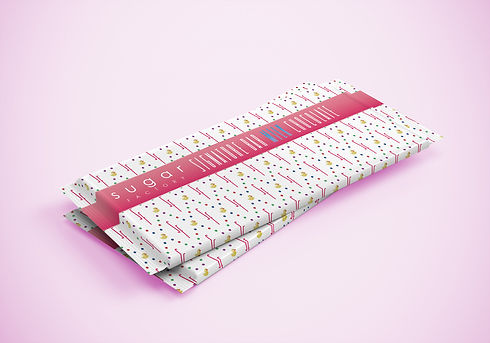
The Sugar Factory is a different kind of candy shop. It's where the who's-who of pop culture go to get their sweet tooth on. With a branding strategy of ever-changing design due to uber trendiness, Jina was able to provide supplemental unique packaging for new and featured products.


PACKAGING THAT POPS
Sugar Factory serves up pop culture confections couture to the average person and international super stars. When the creative director approached Jina to design new and trendy chocolate bar wrappers, Jina delivered packaging that was unlike anything they've ever seen before; attracting patrons with their eyes, leading to outstanding taste.
Celebrity images © Sugar Factory
BRAND REQUIREMENTS
Though Sugar Factory was interested in new packing patterns and designs, they were only open to using their full color logo. This created a little bit of a challenge because the colors of the logo could clash with Jina's new designs. Of course in the end Jina designed eye catching wrappers that incorporated the full color logo that everyone loved.


FLAVOR STYLE BOARDS


Working with her creative contacts at Sugar Factory, to get the ball rolling in the right direction, Jina was tasked with putting together captivating style boards for dozens of proposed flavors.
Orange Coffee Treat


Flavors marketed for kids, and parents used bright, complimentary and contrasting colors. Jina pulled to put images or sketches of key ingredients on the wrapper so patrons could easily identify foods they may be allergic to. That idea was shot down. Bummer.
PACKAGING FOR KIDS


NOIR BAR
Jina's design for the Milk Chocolate Noir Bar was the most favored by all Sugar Factory decision makers. The concept was to use a modern aesthetic, tying in black in white geometric pattern and pops of color from the logo. The target audience was hipsters , millennials and the cool crowd of candy culture.


VARIETY WAS KEY
The goal was to attract new and existing customers to the Sugar Factory chocolate bars by creating exciting packaging. Though the process Jina presented many styles per market, with fleshed out brand identifiers. After Sugar Factory chose their favorite concepts, Jina created full working files, then handed them over to the clients for the in-hour team to use for production and go to market.


